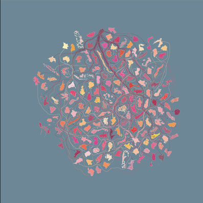
Recent Plans for the Equal Distribution of Equality (2008)
digital prints 900 x 900mm
 |
Recent plans for the equal distribution of HIV/AIDS |
 |
Recent plans for the equal distribution of fertile women |
 |
Recent plans for the equal distribution of men and women |
 |
Recent plans for the equal distribution of the internet |
 |
Recent plans for the equal distribution of literate people |
 |
Recent plans for the equal distribution of population |
Recent Plans for the Equal Distribution of Equality includes six maps based on the equal distribution of the following factors across the world's nations: population, literacy, gender, people living with AIDS, internet hosts, and fertile women.
Each map shows the world's countries resized to assume a near equal land mass. The countries are colour coded -- although there are so many of them that with the limited colour range, their differences may not be readily discernible.
There are fifty dots in each country. Each dot represents the world average of the factor illustrated in each map. The loose arrows indicate the redistribution route and if something is redistributed to another country, the originating country's colour is present in the end country's dots, relative to the amount of whatever is being redistributed, so it's evident which countries are "giving out" and which are "receiving".
The countries are randomly placed in each map -- and are placed differently in each map. There is no standard map. Each country is clearly "free-floating" and "independent".


